Mapping 1 year of social conversations about Churchill for the National Trust’s new exhibit
What gets people talking about Winston Churchill today?
The National Trust – a conservation charity and the largest membership organisation in the UK – invited Pulsar to help tell the story of what Britain’s wartime Prime Minister means in the public imagination in the UK, 54 years after his death.
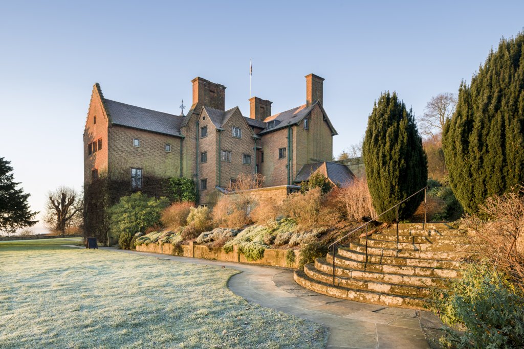
In order to do so, we analyzed 370,000 posts and retweets which are represented in the visualizations below. These will be shown as part of 'A history of Winston Churchill in 50 objects,' a new exhibition at Chartwell, Churchill’s family country home (which opened on 12 January 2019).
The main findings were:
- Every day, there’s a consistent baseline of about 400 people talking about Churchill
- This conversation spikes right up when people use social media to discuss the values associated with him, and debate long-held opinions about his legacy
- Churchill is not just a historical figure: he forms an important part of contemporary British identity, referenced as a symbol in current debates about EU, freedom of speech and the composure of current politicians
Before we dive into our research more deeply, you may ask yourself: why bring social media data into an exhibition, particularly one about history?
We’re glad you asked.
For one, we believe this kind of research allows us to see just how relevant Churchill is to Britishness even in 2019, showing us how history is not static, but being continually shaped in an ongoing discursive process.
This builds on our previous work with the Design Museum, where we visualized online discussion and perceptions of political leaders like Angela Merkel and Emmanuel Macron.
Data of public social conversations also widens the range of voices given representation in the exhibition: it's a democratising move, allowing for a greater diversity of people who are allowed to speak about history and 'great men'.
Of course, this is not a complete representation of every single public opinion, and curators are using other techniques for visitors to share their views, too. But as one technique for public engagement, we hope it's one other museums and galleries will consider too.
What we tracked
Our search design was straightforward: all mentions of "Churchill" (and the adjective "Churchillian") in UK social media, between 1 October 2017 and 30 September 2018. That added up to 370,000 posts and retweets which are represented in the visualizations below.
We had three criteria for the data collection. First, we wanted to hear primarily from regular people rather than news organisations. Second, we wanted to focus on UK discussion. And finally, we needed to collect data historically, so we could explore how conversation changed over a full year. Consequently our dataset focused on Twitter and forums discussion, as the channels that fulfilled these requirements.
What we found
1. Churchill conversation is 'spiky' and reactive
There's a consistent baseline of about 400 people a day talking about Churchill as he spontaneously comes to mind.
Conversation about him, like most topics on social media, is "spiky" - these habitual discussions are contrasted with peaks of high activity which are more reactive, as people respond to high profile and sometimes controversial tweets about the man, debating, agreeing and retweeting.
We can see these spikes are often driven by people discussing the values they associate
with Churchill, and what he means for Britain today.
2. Churchill's not just about history, he's about British identity today
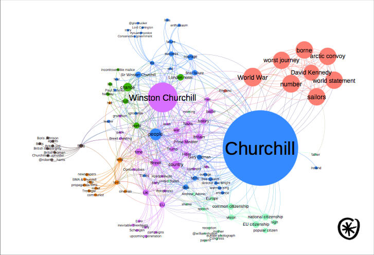
This chart really shows just how strong the association is between Churchill and topics of current political debate. You could say he's barely a "historic" figure at all, given how contemporary are the debates in which he is referenced as a current, relevant symbol. This chart is a 'semantic map' showing how different words co-occur in the dataset, and grouping them into topic clusters of association and meaning. The size of the circles indicates the frequency with which a keyword is mentioned - while colors cluster keywords into related topics. A viral tweet about the World War II Arctic Convoy – described by Churchill as “the worst journey in the world” – creates one topics cluster. MP Boris Johnson, questions of the EU and European “common citizenship”, and freedom of speech are three more prominent topics.
3. Social media is a venue for challenging opinions
Two trends dominate the personal characteristics people online associate with Winston Churchill: firstly, perceptions of his leadership, heroism, and strategic insight.
Secondly, a complex conversation is happening about how to reconcile his legacy and his record of fighting against fascism during the Second World War with his actions and public statements about British imperialism, with many debates about whether his views on Empire mean that he could be described as ‘racist’. As the topics in the chart above suggest, there are strong views on both sides.
Thoughts on research design and possibilities for the future
It's important to acknowledge the ways that our data sources shape the research results - as would be true for any and every research methodology. For example, our need for historical and UK-located data meant that we didn't collect Facebook conversations about Churchill - which might likely have involved an older audience, as this platform has the most age-diverse userbase in social media.
Instagram (trackable) and private Facebook Groups (not trackable) could provide a wealth of Churchill memes - from wholesome to dank - as younger audiences parse their History GCSE homework, Brexit, and what Britishness means today.
Segmenting the Churchill Twitter audience with our partner Audiense would be a third opportunity to get insights into the different groups of people talking about the former prime minister, and the ways in which their feelings about him - and the sometimes conflicting visions of Britain he is seen to stand for - vary and conflict.
But I was reminded by working with the National Trust is just how important it is that social data visualisations should be accessible and easy to understand. We worked hard on the graph captions and descriptions to make sure they made sense for people who aren't social media users and don't know their quote-tweets from their subtweets - which will be a significant number of the exhibition’s visitors.
At Pulsar we do enjoy producing beautiful and whizzy social network visualizations when the time's right! I still think very fondly of the videos we made in 2013 working with Twitter, exploring how topics go viral over time.
But ultimately the National Trust wanted to focus on the more familiar line charts, bar charts
and pie charts in order to prioritise accessibility, an decided not to show the topics network
visualisation on the wall display. Graphically complex visualisations can be stunning, but sometimes that complexity is much of what they communicate - they're more 'wow' and 'oooh' than information delivery tools. There's absolutely a place for that in public communication - particularly in terms of marketing and PR. But sometimes it's best to get back to basics, too.
For more information about the exhibition or to plan your visit where you can see the visualizations described above, see the National Trust Chartwell website.
Or read more about our visualization work with the Design Museum, and with the British Fashion Council. Or follow Jess on Twitter to ask her more about this work
Chartwell image: Tracey Willis/National Trust