Social Q&A: #3 Build your own charts with Pulsar’s clusters
In this series, our Head of Account Management Jamie Watson addresses frequently asked questions about audience intelligence platform Pulsar. Whether you’re a frequent Pulsar user or still evaluating a social media research platform for purchase, Jamie’s tips, tricks & useful info aim to highlight what to look out for. This week: yes, you can build your own customisable graphs in Pulsar.
Have you ever had been asked a reporting or research question which requires an output that the pre-defined visualisations within Pulsar do not cover? I imagine the answer is one of the three:
1) No, the wonderful visualisations solve my every need (woohoooo!)
2) Yes, and I used the clusters to build a bespoke care to answer the question
3) Yes, and it was frustrating that I had to export all the data into Excel and create the relevant chart offline
Within this short blog I'd like to address the third group of people. When we're onboarding our new customers, there is a lot of information to take on, and with clusters sitting all the way on the right hand side of Pulsar's dashboard, it's understandable that this feature is sometimes overlooked:
If this is the case, or even if you are a little hazy on what you can use clusters for, this post is for you - I've include some pearls of wisdom below:
What are clusters?
Clusters are charts, built by you, to compare different segments of the dataset. This means that within the clusters tab, you can build multiple charts to build a bespoke dashboard that will be saved to the search.
What charts can I build with the Clusters function?
Within clusters you can build:
- Bar charts
- Pie charts
- Line charts
- Word clouds
What can I compare within these charts?
As you are comparing filters against filters in the cluster function, you are able to compare any of the variables outlined in the filter. These can include:
- Comparing products against products within a brand search
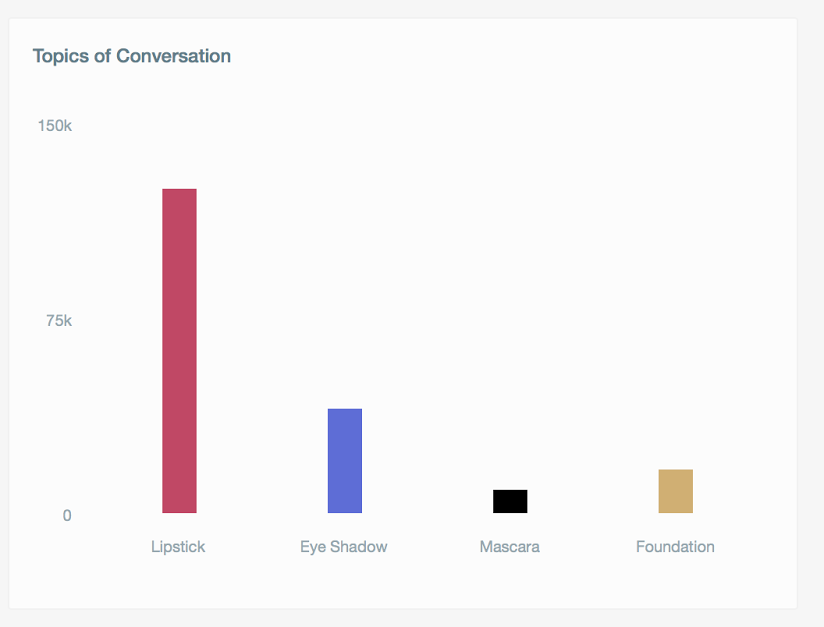
- Comparing topics of conversation within a category search
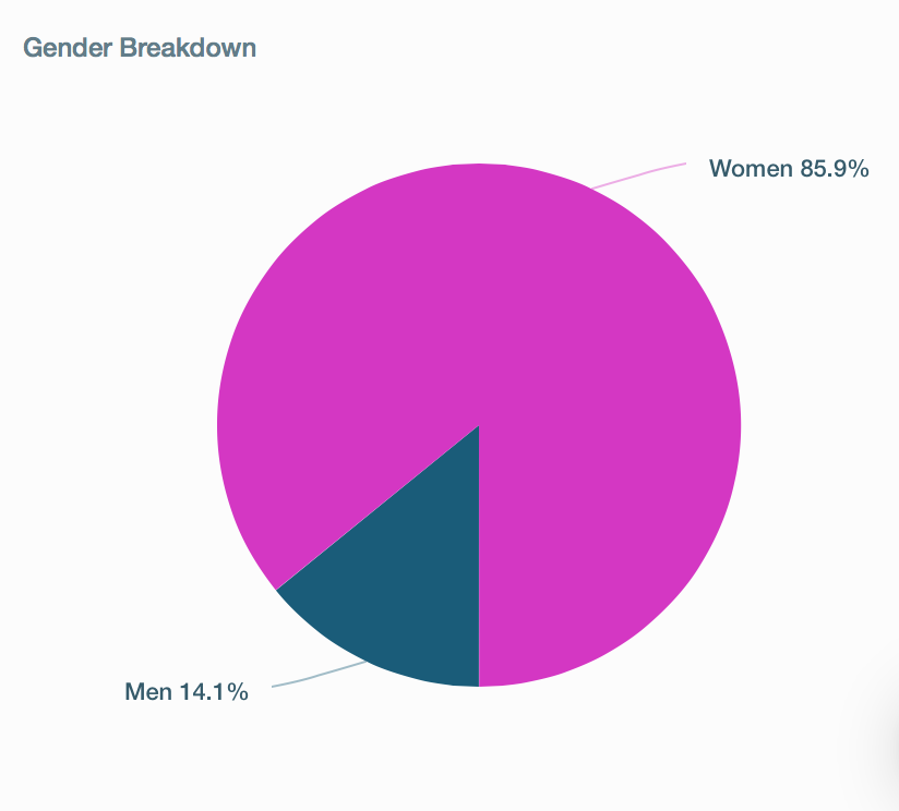
- Comparing gender breakdown within any search:
That's great, but I've got a bespoke colour scheme in my report and my report is in Powerpoint...
You can customise the colours of the chart to match your report and then export your clusters directly into Excel, as a jpeg or even as a Json file.
For those who are very familiar with clusters this information may seem very simplified, however for those beavering away in Excel to create charts on exported data, this could save you hours and in turn make your life a lot easier jordan retro 2. We have published a few blogs on clusters over the years, so if this has been interesting, the following might be useful to check out:
If this sounds interesting and you’d like to find out more, please get in touch: [email protected].
If you’re an existing Pulsar client and you'd like some more info on how clusters can help you make a difference in your reporting, just contact us on [email protected]. Of course you’re always welcome to give us a good old fashioned phone call too, reach us on +44 (0)20 7874 6577