Brand Dig: Toblerone, Starbucks and Qantas dare to make a change, set Internet on fire
In this blog series, researcher Harry Symington digs into the world of social media and discusses brands, news, trends and examples that have made the digital headlines.
This week, Harry looks at the major online backlash chocolate manufacturer Toblerone received for changing the shape of their famed pyramid-shaped bars, as well as two other examples where we, the people, appear to have some issues with change when it comes to our beloved brands. Starbucks has faced major backlash over a wrongly perceived Christmas cup (green! it's GREEN!) and Qantas tries to pre-empt online punishment for a branding update. Ch-ch-ch-changes: sometimes, they're just a bit much to deal with.
Toblerone dares to redesign the iconic triangles
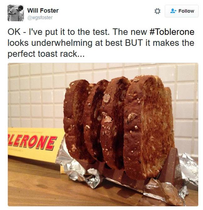
Loyalty is what every brand craves. But what if your consumers are such diehard fans that it makes it hard to tweak your brand – even if it’s just a little detail. Toblerone is learning this first-hand after it decided to add a gap between the chocolate triangles – and it’s made people quite upset.
Toblerone is perhaps one of the most distinctive chocolate brands in the world. It’s long shunned the “conventional” shape of rectangular chocolate chunks and instead been proud of its 3D bars. But the brand might not have realised how important this distinct shape is for its consumers cheap girls air jordan 10. So when it spaced out the chunks to reduce the weight of the bar, Toblerone was perhaps a little surprised by the backlash.
People have described the redesign as a “dumb corporate decision” and it’s even led a few to declare they will no longer be purchasing the brand: “Quite frankly you're horrendously greedy. This is the final straw. I'll now refuse to buy any of your products.”
So is the backlash justified? While Toblerone claimed it wanted to reduce the weight of the bars, cynical consumers see the move as evidence of corporate greed putting efficiency/profits ahead of enjoyment. Aside from that, people have noted that it now looks cheap – and that’s what could affect sales of the iconic triangular chocolate.
Starbucks teases festive customers with a green cup
Christmas has such a strong association with rituals that cue Santa is almost here. There are the fairy streetlights that go up, the Christmassy TV adverts, and the carols. Alongside these signals are smaller events – but no less important to the consumer. One particularly special moment (for some) is the arrival of the Starbucks' red Christmas cup. This “holiday cup” has become something of a tradition. Every November, the coffee brand redesigns its cups with distinct Christmas themes such as baubles, snow and reindeer.
But this year, the brand decided to release another limited edition cup (supposedly related to the elections) at a similar time, making people think that this was the Christmas cup. The problem? The cup is green, and the design includes a mosaic of over a hundred people drawn in one continuous stroke, to promote the idea of unity in a politically divided country. And this has caused coffee lovers to be absolutely flaming with rage.
Naturally, people have taken to the internet to voice their concerns. “Went to get my first Red Cup and it's GREEN? WHAT? My gingerbread latte is instantly less festive. So mad ?@Starbucks.” Others felt it was an attack on their favourite holiday: “Starbucks....GREEN CUPS!? War on Christmas. Last days.”
It sounds like the Starbucks' Christmas cup is so much more than just a red cup. For many people, it’s just as important as decorating the tree or buying presents for loved ones. It’s the start of Christmas. Thankfully for those who don’t feel festive without the green cup (or didn't understand this wasn't the holiday cup in the first place), Starbucks will in fact be serving its coffee in a Christmas cup this year – and it will indeed be red. Phew.
Qantas tries to pre-empt a backlash against its new look
While people might fall out with brands because of unethical or unsustainable behaviour, bad logo redesigns can conjure a similar type of rage amongst consumers. While passengers are unlikely to refuse to fly with Qantas because of the design on the plane, the airline is pre-empting a backlash to its logo makeover.
The brand unveiled a new look, which includes an alternative typography, a tweaked tail-fin and the introduction of a retro kangaroo under the cockpit. While Qantas acknowledged it could be seen as superficial redesign, the brand looked to reassure consumers that it’s not change for change’s sake. The company says it’s meant to signify a significant transformation across Qantas to deliver a greatly improved experience on-board.
So why the pre-warning? As Qantas has recognised – people really dislike redesigns that have no other significance than decoration. It’s now up to the airline to match its new contemporary look with the experience it’s promising.
Interested to hear how Pulsar can help get you to understand your audience? We can show you how. Drop us a line: [email protected]