Illustrating impact: visualizing data to tell better stories
Research professionals are valued according to their ability to consistently deliver impactful insights within their organizations in a way which facilitates strategic decision, and action: so it’s no surprise that interest in communicating insight through “Data Visualization and Storytelling” is given top billing in this survey.
We see it every day in the conversations we have with our customers and partners at Pulsar. Whether they subscribe to our self-serve insights tool, or team up with our insights consultancy, (or both!) researchers are consistently on the hunt for smart ways to visually illustrate insights in ways which will resonate with their own audiences, customers, colleagues, or other stakeholders: from the performance of campaigns, to the impact of brand initiatives, or how trends spread and grow.
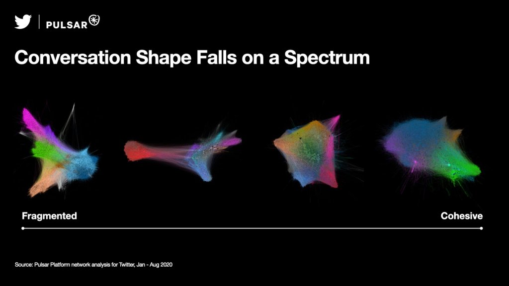
In our ongoing research partnership with Twitter, for instance, our teams are collaborating in finding new ways to map and illustrate how ideas spread and how content travels online: from the invisible social structures of the enormous public conversations happening on Twitter, to sketching out the “shape of an audience” along with its social ties and affinity networks. These kinds of visualizations require not only the right data sources and network analysis capabilities, but also a willingness to invest in sophisticated data visualization tools and methods.
This trend towards more effective insight communication is evident even within our own teams: throughout Pulsar’s parent company Access Intelligence, our research and marketing team has made significant investments to facilitate our researchers and marketers’ ability to tell stories through social, news, audience and search data.
In the survey, the fact that 75% of buyers spontaneously spontaneously said that they are considering “Text Analytics” and 50% said “Social Media Analysis” when asked “what new technologies, methods, or approaches” they are considering, suggests there are huge opportunities to tell (and visualize) audience-first stories about how the public and the news media engage with topics on social media and the web.
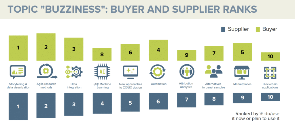
Moving one step further up the research “stack”, respondents’ focus on technical and innovations topics like Agile, Data Integration, and AI reflects our experience, and the increasingly messy nature of the research buyers world. As they sit on ever increasing mountains of data, buyers are looking for technologies able to bring structure and order to the data. But integrations create challenges themselves, especially around speed and scale – this is likely what’s behind the almost equal importance given to automation as integration.
Main trends aside, the relatively low scores for blockchain are unsurprising. Technology is a means to an end and will start to become seriously attractive for GRIT readers once its application for our industry specifically is understood. It could, for example, be a means for delivering data integration in the future.
If you would like to view the 22 GRIT Insights Practice Executive Summary, you can access it here.