Social networks are getting less graphically diverse: why?
What Starbucks and Whole Foods did for hip neighborhoods, and Ikea did for city apartments, seems to now be happening on social media. As platforms ‘borrow’ functionality and looks from each other and converge towards design choices promoting ease of use and engagement graphical diversity among different platforms is steadily decreasing.
Here’s just a few examples:
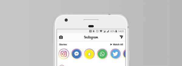
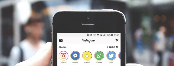
- The proliferation of a “stories” tab displaying a sequence of circular profile pictures across Facebook properties (Instagram, Messenger, Facebook app, Whatsapp…) as well as Snapchat
- The circular profile picture itself, now ubiquitous across FB, LinkedIn, Instagram, Twitter, Pinterest, Google, and Apple products
- Within the circular profile pictures, green ‘active’ status (FB, LinkedIn)
- Twitter adopting the heart-shaped ‘like’ button in lieu of the ‘favorite’ star
Why is this happening? And may this homogenizations today’s social networks going to be replaced by many niche, uniquely designed platforms?
The business case for uniformity
For social platforms, it makes perfect business sense to “steal” user interface elements from one another, converging all towards similar look and feel.
Gradual improvements to products and design taking over product lines are the norm in many fields: just look at how backpacks started including a portal to thread your headphones through as we became more addicted to personal music players; when seemingly all toothbrushes took on a ‘tongue scraper’ at one point; and white headphones becoming commonplace after Apple’s famous iPod ‘silhouette’ ads.
Twitter explained its decision to move from the star-shaped ‘favorite’ to the heart-shaped ‘like’ as an opportunity to be “more expressive”. But likely the decision was taken because the heart is a less ambiguous symbol than the star: people instinctively know what it means, and thus use it more.
So design and user experience are therefore being shaped by crowd behavior: what the users respond well to, they are getting more of. “Liking” through a thumbs-up or a heart has de facto become the main grammar point of social networks.
Similarly, circular pictures became the preferred way to display your profile headshot: the reasons why this happened are many, that go from “clearly helping users distinguish other users from content,” to “incentivizing users to use actual headshots as profile pictures, as described by Mills Baker and other designers in this fascinating Quora thread.
More room for experiments at the margins
But this growing uniformity leaves room for other platforms to try out different approaches: Are.na is a social network for creatives intentionally designed as an antithesis to the big-box social networks.
“I think a lot of current social networks don’t put enough trust in the user to think for themselves and in a way they overdo it in terms of the style, the colors, the language–you notice a lot of sites that use this real jokey and playful language,” said Co-founder Chris Sherron in a recent article.
Limiting the graphical diversity on social may mean also limiting users’ ability to express a full range of ideas and emotion. If we can only ‘like’ everything, everything we have a strong preferences for gets bundled along with things we are often barely interested in.
With studies reporting that high like percentages on users’ social media posts contribute to their happiness, posting to each channel becomes formulaic, an easy way of seeking a quick dopamine fix during some downtime, rather than an expression of character.
And as the algorithms behind the content suggested to users continue to be optimized with similar engagement-driven metrics, “the like button is the most mindless thing you could possibly do,” says Chris Barley, another Aare.na co-founder with a background in architecture. Indeed, the company’s tagline is “spend less time ‘liking’ and more time thinking.
Where to next?
As 2018 shapes up to be the year platforms begin to try and improve the time spent within the digital spaces they have created, they may also consider how some of their design choices have been de facto crowdsourced. Most of our online life seems to be merging into a superstore of generic social interaction.
This may be relevant not just for users, but for marketers and advertisers. Marketing teams are currently advised to tailor their social media strategies to each platform, but with each of them becoming more like the others, the strategies themselves may become less diverse too, adding to the repetitive nature of the content we see.
Social networks are set up to drive engagement, so does a narrowing of graphical diversity promote the right kind of engagement in the long term?
And will humans find a way to infuse layered meaning in what they do online? At the time of the Twitter heart/star deluge of reactions, Robinson Meyer in The Atlantic was hopeful:
“The great prediction about online social networks is that our emotions would be denuded as they were shuttled into quantification. Your tweet got x many faves, x many retweets, x many link-clicks. That has happened, in part, but our emotions have also deluged and overwhelmed those same quantifiers. At its face, the star was nothing more than a validate button. But to its sender and receiver, ★ could be a hug, chuckle, or a cold shoulder. But to its sender and receiver, ★ could be a hug, chuckle, or a cold shoulder. As ★s become ❤, as whatever replaces Twitter is itself replaced, that won’t go away.”