South African Elections: Unravelling the social conversation on voting day
The recent vote of no confidence in the South African elections called for the removal of the current president, Jacob Zuma, from his seat in office. The goal of Conversation LAB, a full service digital and communications agency based in South Africa, was to understand and identify the major channels and networks through which people were communicating during the voting day. This would help them understand what conversations were the most impactful, and the networks these spread to, and how integrated or segregated these networks were.
During the election campaign, major opposition parties joined ranks in this effort to stand up to ruling party ANC, who said they would not vote in favour of this motion, despite several of their own MPs defiantly supporting it. The vote was a major divisive catalyst for an already fractured government, considering that the ANC whipped their members to not vote with their own conscience and instead vote with the ANC party line.
It is claimed that the ANC government has been heavily implicated in corruption, nepotism, kleptocracy, and cronyism amongst a myriad of other charges. The way in which the vote was carried out shed light on a bigger narrative concerning the country's future and governance.
As Conversation LAB started to use Audience Intelligence methods using Pulsar’s TRAC platform, they were able to uncover unique insights which then, in turn, converted into eye opening visualisations. The visualisations were used to identify what networks were communicating throughout different times of the voting day, and to see the most impactful and dominant.
Result
What was uncovered showed that the conversation, whilst broached by many macro and micro-influencers, spanned far and wide encompassing a variety of online communities. Conversation wasn’t driven by any single group of influencers, it was present uniformly across the social web. Klout or connections clearly had held no significance when it came to ensuring your voice was heard.
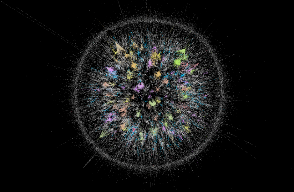 This visualisation shows conversations by network during a spike in conversation in the afternoon. Many networks (colourised) are driving the conversation, with even smaller networks being dominant drivers, intersecting and extending beyond the main network hub.

This visualisation shows conversation by network throughout the voting day. What’s important to note is that there is no single set of networks driving the conversation. Many different networks, some interconnected and some not, are contributing to the narrative.
How It’s Done
Data exported directly from the Pulsar TRAC platform into Gephi provided the opportunity to show the closeness and / or scale of the individual or entire network(s) and custom colour-code the graphs so that the biggest networks were easily identifiable. In addition, we were able to view networks as a percentage of the conversation which was very useful when dealing with datasets of this size.
In this way we were able to capture a key moment in South African political history using social data as a medium. It's often difficult to translate large numbers into something cognitively palatable, but with a combination of structured Pulsar data & sophisticated Gephi visualisations we can start to comprehend the scale of nation wide conversations.