New on Pulsar: Top Stories, an instant view of what’s driving the conversation
Today we're really excited to share with you the launch our Top Stories feature, which overlays the best performing posts on the volumes chart in the Overview tab. Top Stories makes it easier to understand your audience by instantly giving you a view of what's driving the conversation.
The feature allows you to view your daily top three stories in the conversation either by number of reactions, by level of reach or visibility score. It brings all your key numbers, overall stats and top content into one place, making it easier and quicker to uncover what’s fuelling the conversation.
You can also apply filtering, which means for example that you can filter by channel to view only content from Twitter, or filter by keywords to view only top posts matching specific keywords.
The video below shows how Top Stories work:
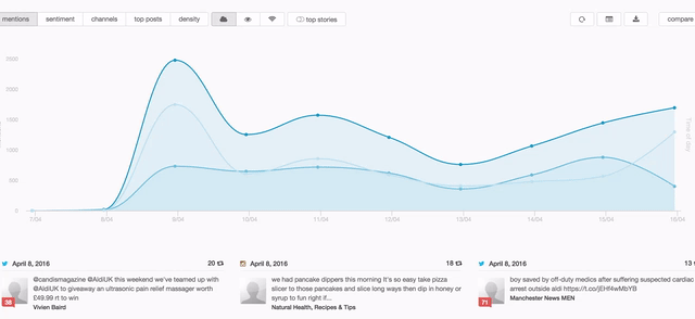
We have also added a rotating content bar right underneath the activity graph (as shown above), which means you can scroll through and view some of the top posts in the dataset. Previously, this section was static only showing the top three posts in your data.
The ability to see bitesize pieces of data while looking at the overall trends gives you the micro and the macro view in one screen, enabling analysis that is at the same time qualitative and quantitave without having to trawl through the entire dataset.
We are looking forward to see what you will do with this new feature! If you’re already using Pulsar and want to learn more about how you can use content tracking, please contact your account manager or email: [email protected].
Alternatively, if you’re yet to experience the power of Pulsar and you’d like to set up a demo, email [email protected] or call us on 020 7874 6577.