Pulsar featured in a new book and a data visualization exhibition! #MappeDelSapere
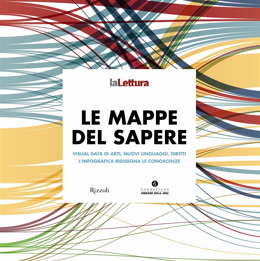
We are very excited to be featured in a new data visualization book and exhibition titled "Mappe del Sapere" (Knowledge Maps), opening tomorrow at Triennale Design Museum in Milan (here's how to get there).
The exhibition, which opens at 18.30 and closes December 14th, features some of the best data visualizations produced over the past 3 years for «la Lettura», the culture supplement of Italian daily newspaper Corriere della Sera. The exhibition and book features fantastic examples of information design and we've added our two cents with an infographic called Gangnam Style vs Harlem Shake: Anatomy of two memes and a data visualisation project called How Stuff Spreads: How Video Goes Viral.
Ahead of the opening, the museum will also host a conference on data journalism titled "Data Journalism: informazione e creatività" organised by «la Lettura» and Fondazione Corriere della Sera and starting at 15.30 at the Teatro dell'arte. The conference will explore the relationship between information and design, research and visual storytelling and will feature Professor Alberto Cairo from the School of Communication, University of Miami, Paolo Ciuccarelli from Density Lab at Politecnico di Milano (the guys behind the excellent RAW) and Daniela Piscitelli from Associazione Italian Design della Comunicazione Visiva.
I'll be in Milan for both the conference and the exhibition opening, so if you want to get in touch hit me up on Twitter at @abc3d or email me at [email protected].